Hyper
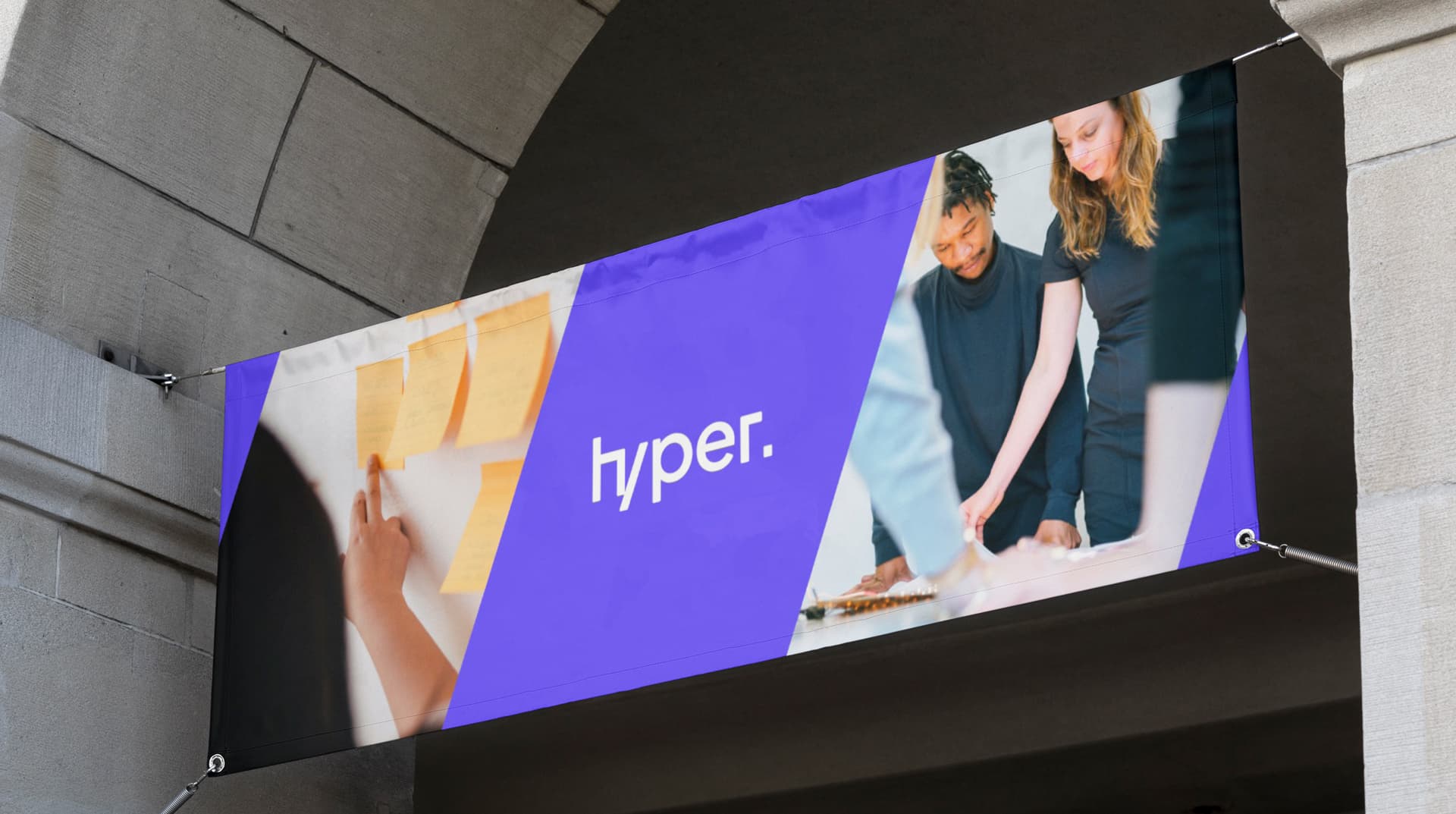
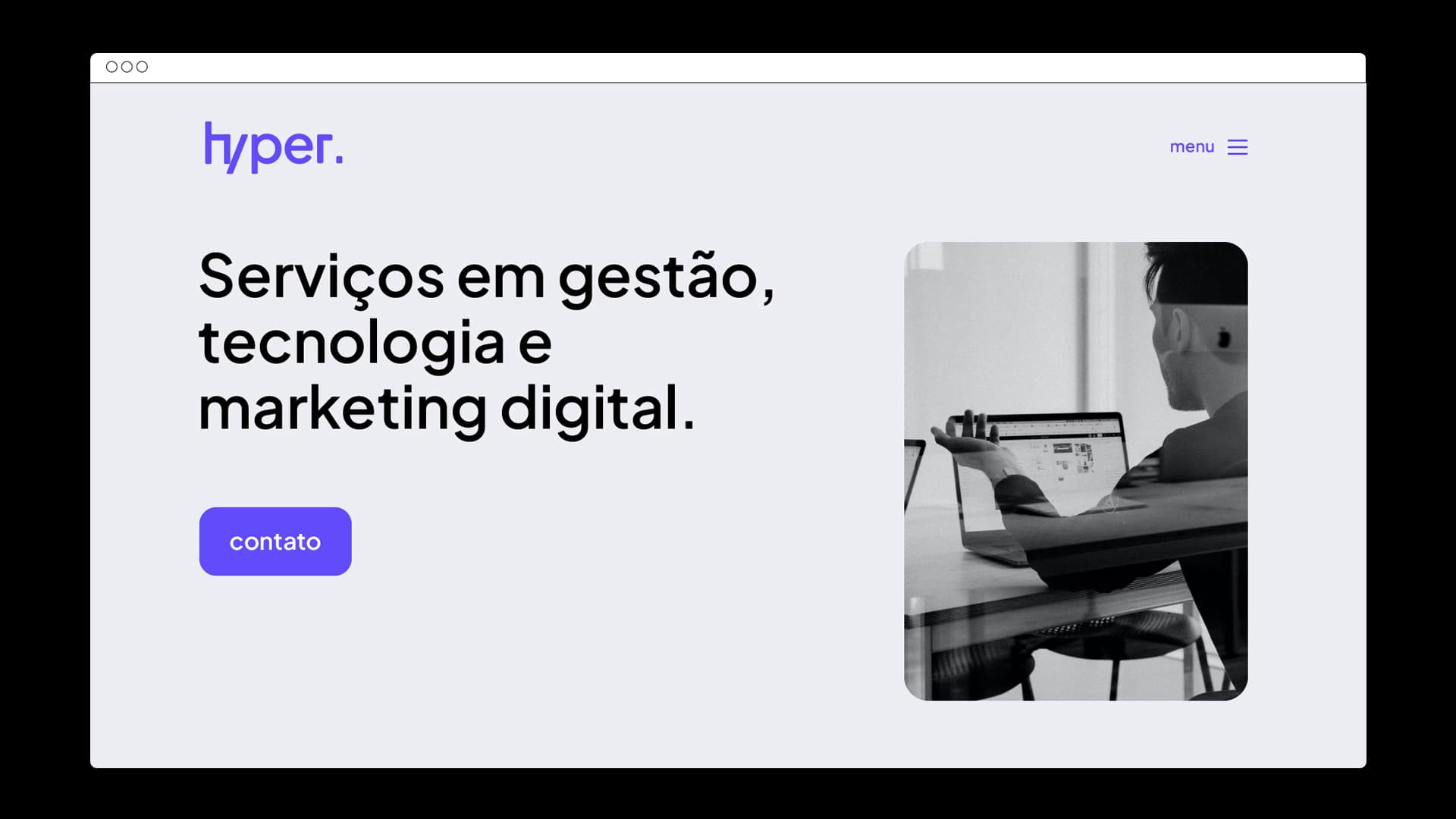
Hyper is the result of a merger between 3 companies - one focused on management, one on digital marketing and another operating in the tech market. The slash and dot in the logo came from one of the previous brands, and these symbols refer to programming languages. The blending of H and Y, via the forward slash, brought intelligence and character to the identity, in a simple and effective way.
Graphic design: Ana Montenegro, Filipe Marones