
Cururu
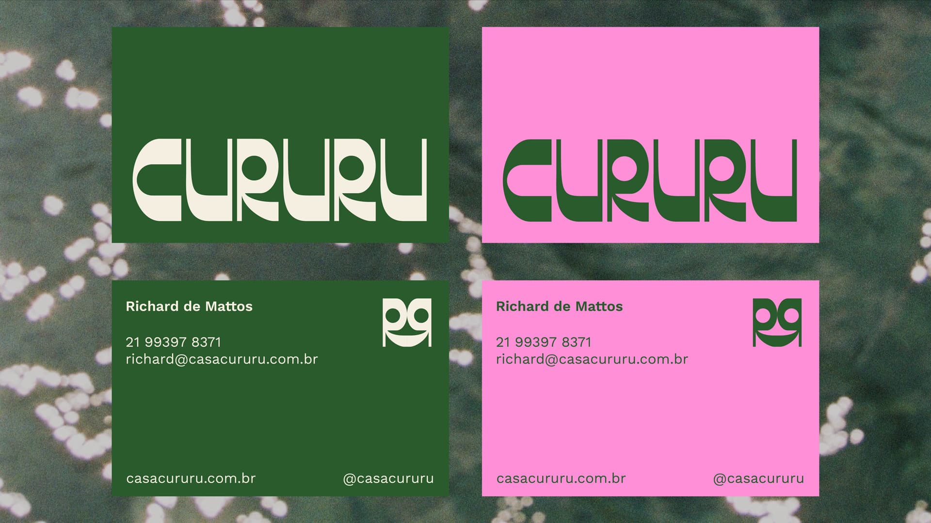
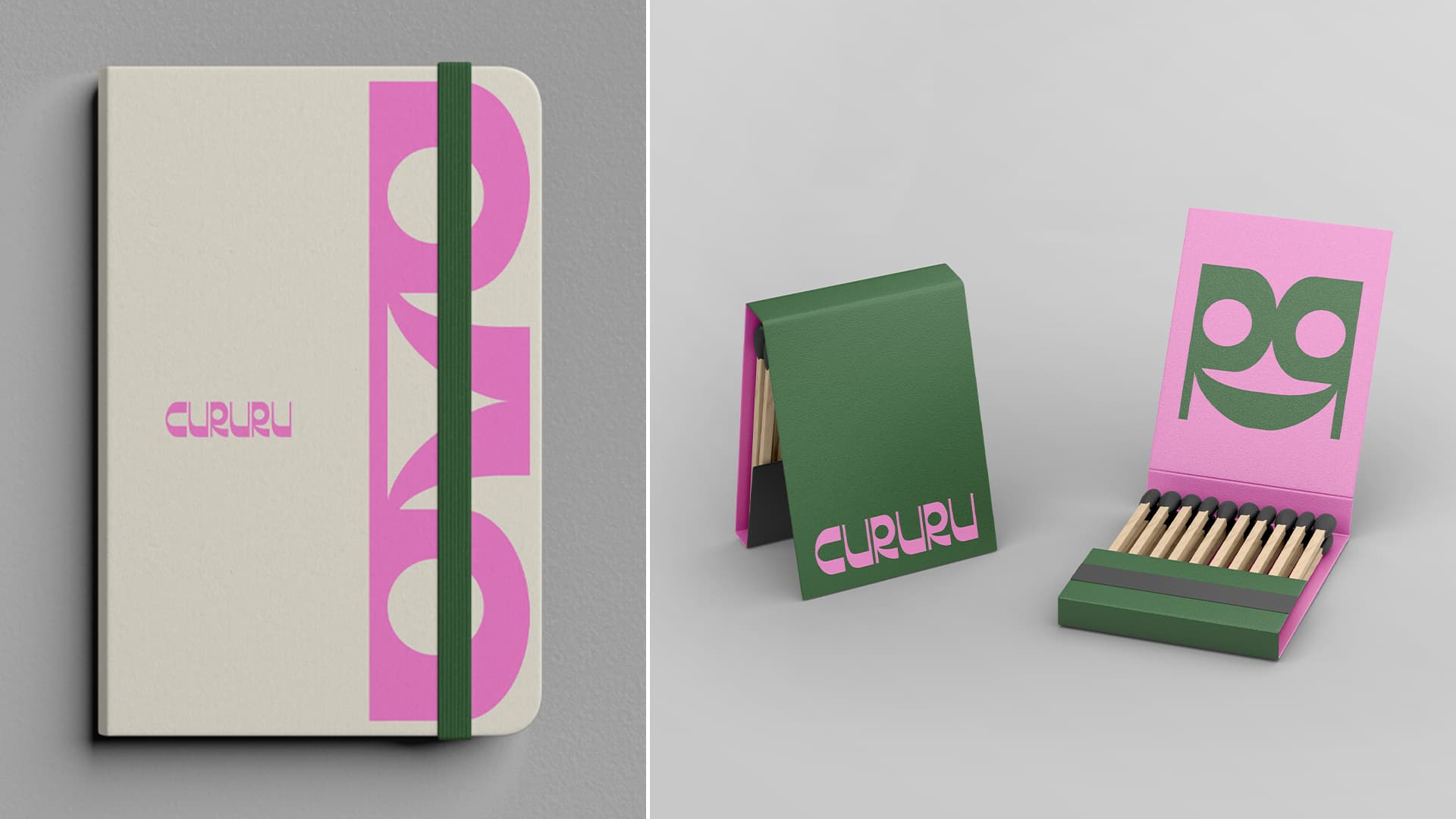
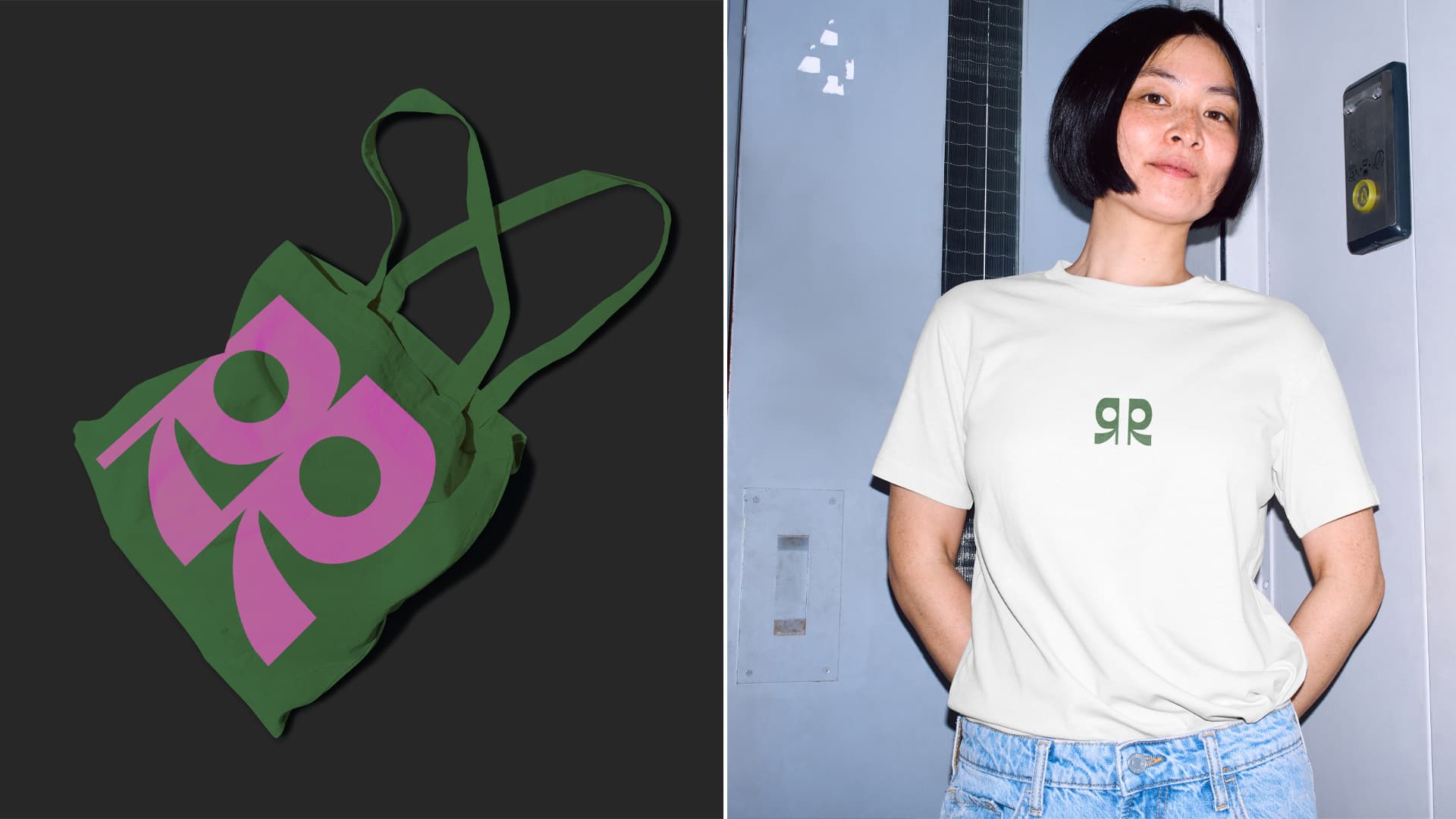
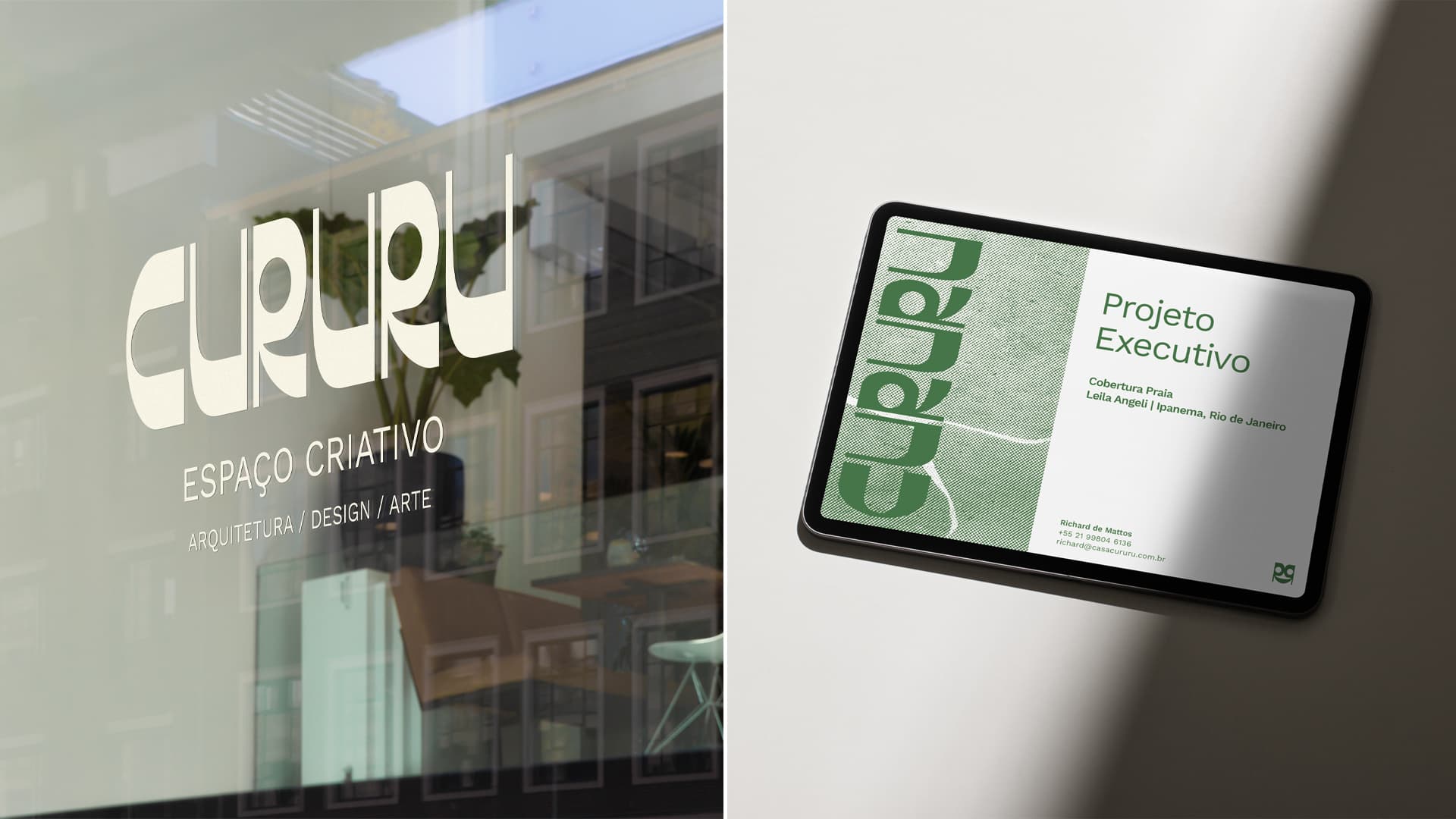
Cururu is an architecture studio which holds the Brazilian spirit as a central element of its identity. In order to showcase this quality, a custom typeface was designed in order to celebrate Brazilian design, while also referencing the cururu toad with its large, round eyes. This idea was particularly embodied in the letter R. The identity becomes stronger when this letter is isolated from the logo, as it can function as a visual symbol and supporting element across various compositions.


Graphic design: Ana Montenegro, Filipe Marones