Casa Poama
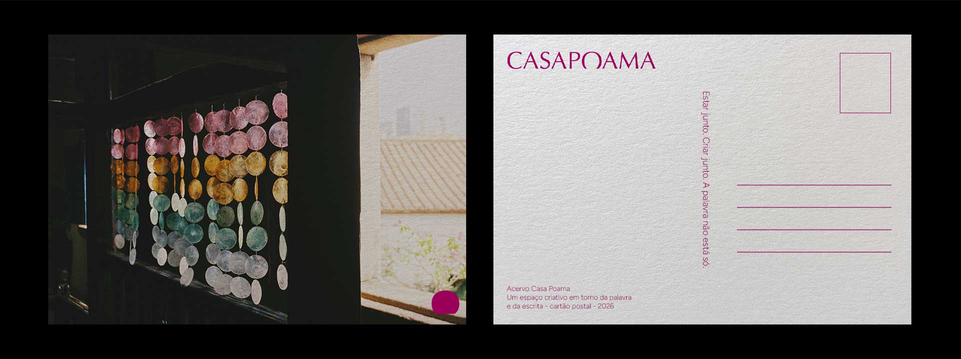
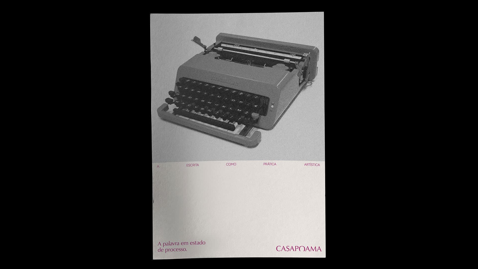
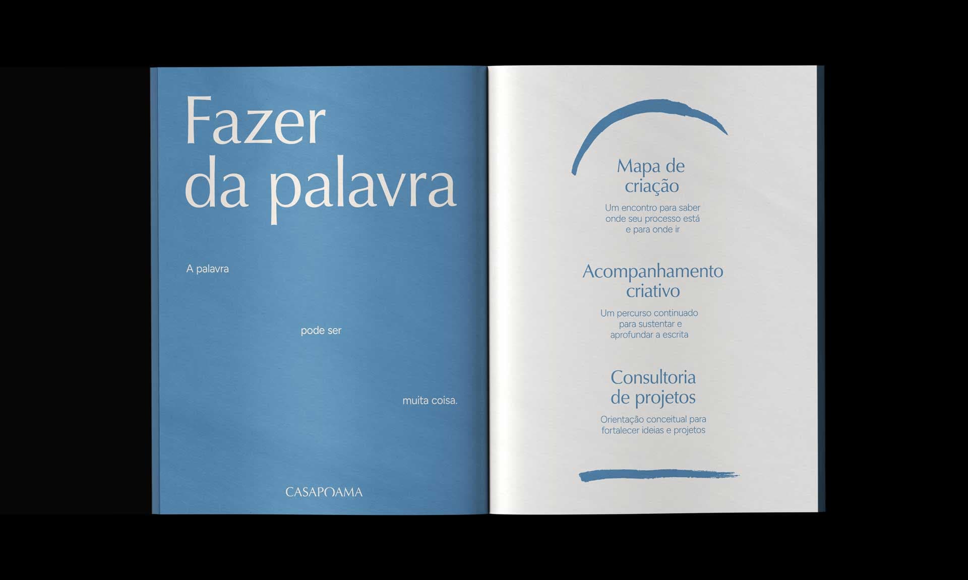
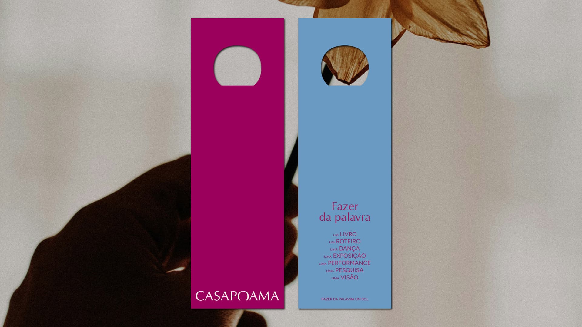
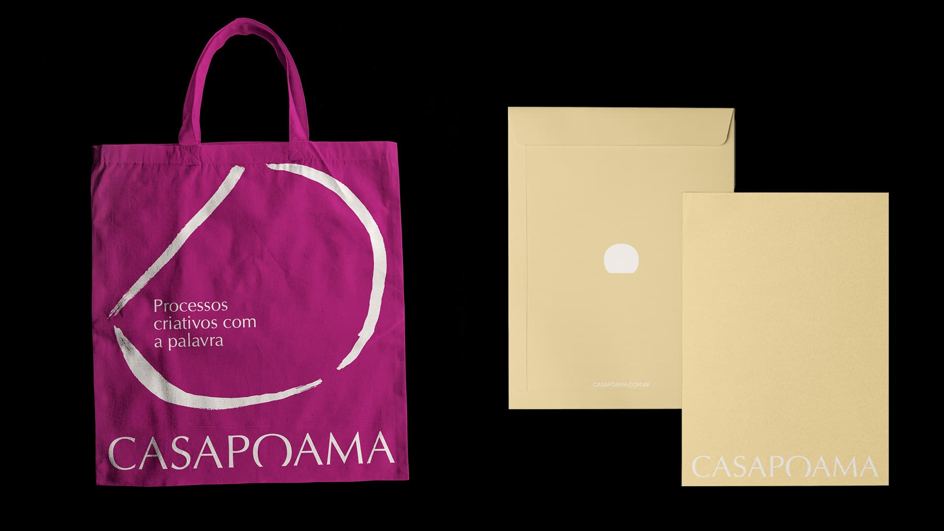
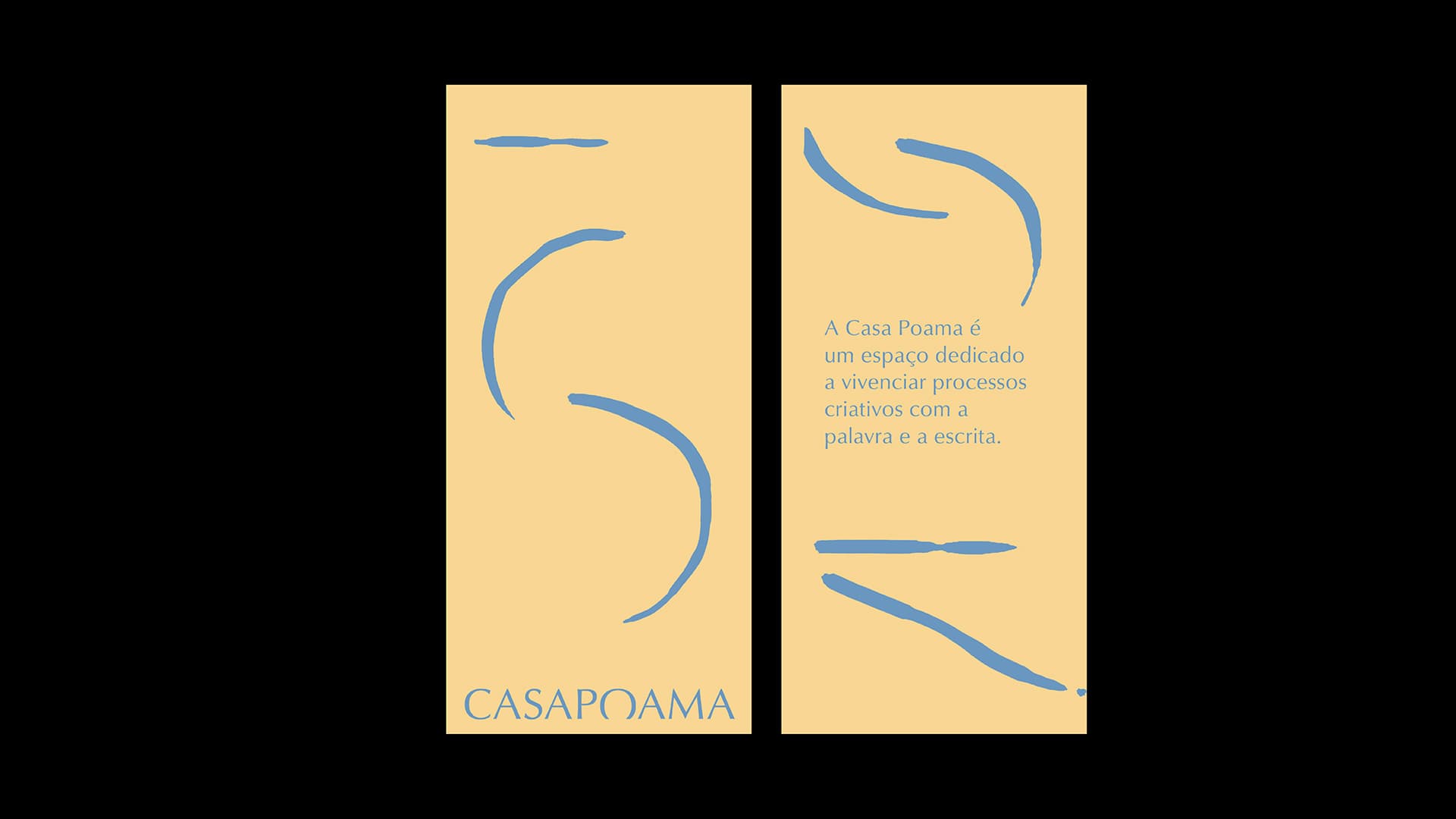
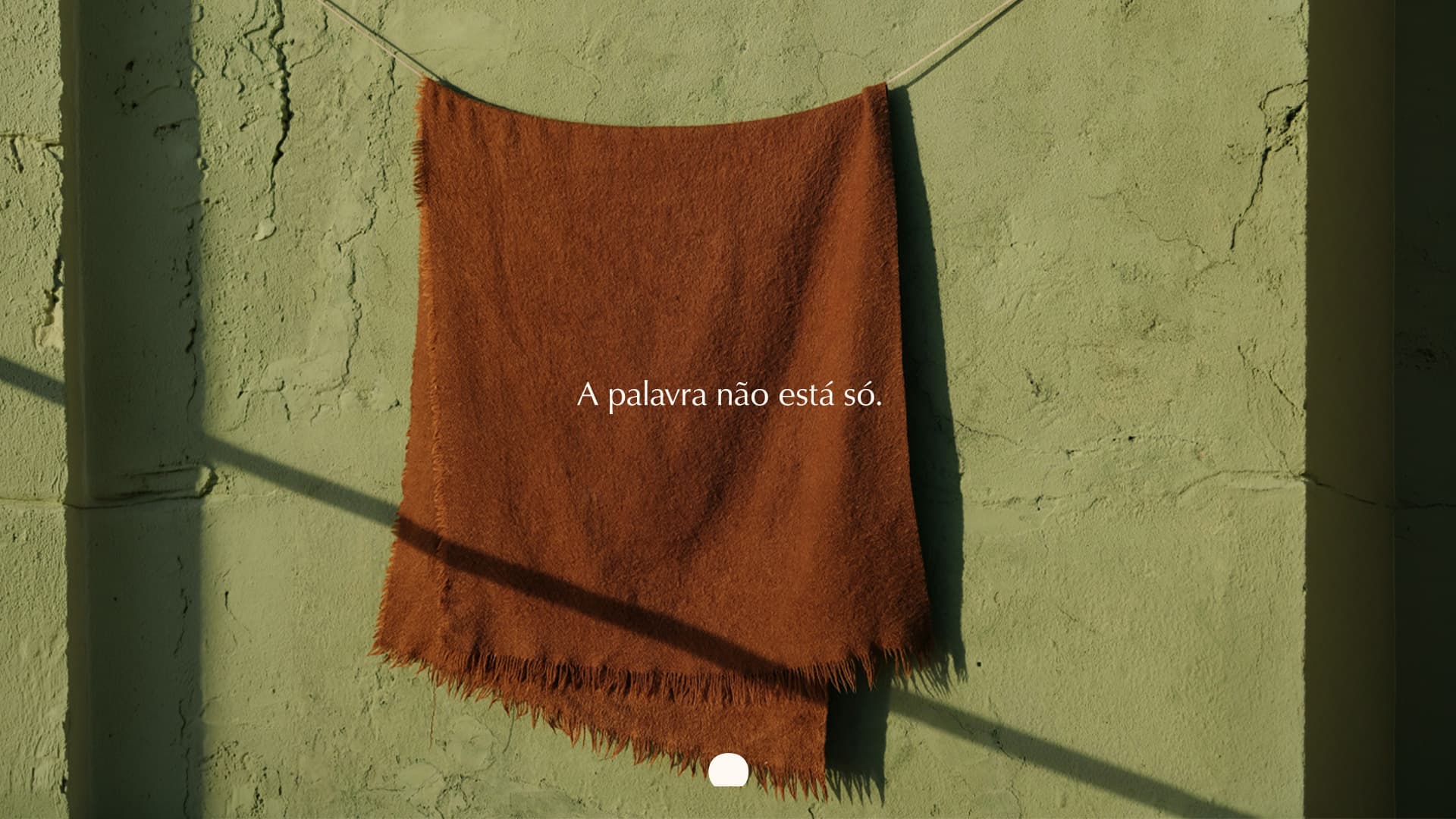
Visual identity for Casa Poama, a creative space centered on words and writing. Delve deeper to bring things to the surface. Based on this concept, the letter O in the logo was designed, with its hidden base conveying the ambiguous sense of something that is set in place while simultaneously sprouting forth. The color palette combines tones that balance vibrancy and serenity. And the photographic universe brings together images that depict everyday life, daily activities, and the unhurried passage of time.
Visual identity: Ana Montenegro, Filipe Marones